Visiting timetableClosed
|Sunday, July 12, 202616 Rue du Repos, 75020 Paris, France
Back to art
inscriptions
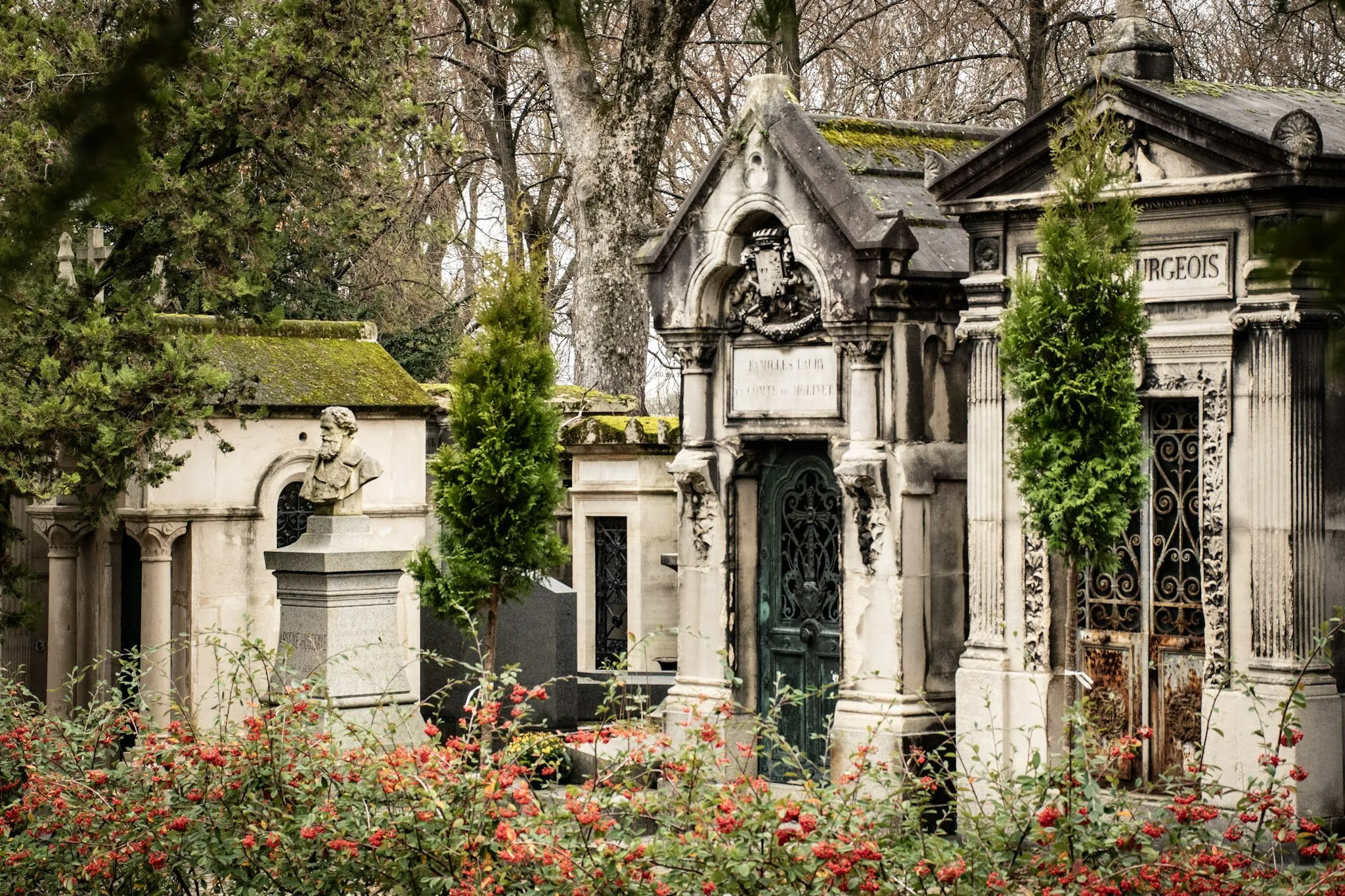
Stone Texts: Typography and Aging at Père Lachaise
A close look at funerary lettering: serif choices, carving depth, and how weathering affects legibility.
11/3/2025
17 min read

Inscriptions speak through form. Serif choices, carving depth, and weathering shape legibility and tone.
Typographic Notes
- Serifs: Classical gravity.
- Sans: Modern clarity.
- Depth: Shadow and readability.
| Choice | Tone |
|---|---|
| Serif | Tradition |
| Sans | Modern |
📸 Gallery
Typography frames memory — letters as voices.
About the Author

Epigraphy Enthusiast
As a long-time Paris walker and storyteller, I created this guide to help visitors find their way through Père Lachaise — from legends and love stories to quiet memorials and the everyday tenderness of remembrance.
Tags
Père Lachaise
Typography
Inscriptions
Carving
Weathering
Comments (0)
Leave a Comment
Loading comments...