開館時間08:30 AM – 06:00 PM
|土曜日, 7月 11, 202616 Rue du Repos, 75020 Paris, France
戻る: art
inscriptions
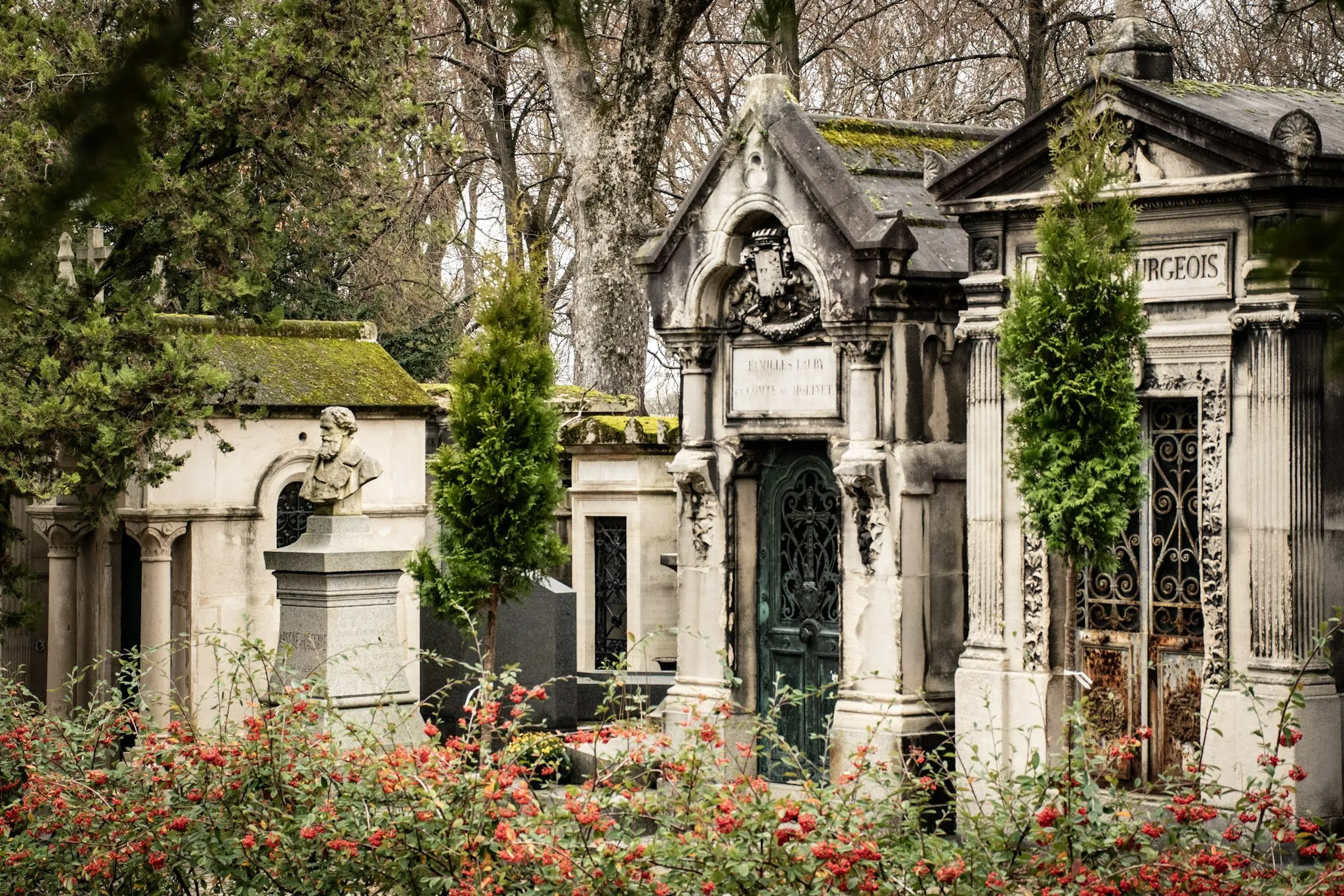
Stone Texts: Typography and Aging at Père Lachaise
A close look at funerary lettering: serif choices, carving depth, and how weathering affects legibility.
11/3/2025
17 min read

Inscriptions speak through form. Serif choices, carving depth, and weathering shape legibility and tone.
Typographic Notes
- Serifs: Classical gravity.
- Sans: Modern clarity.
- Depth: Shadow and readability.
| Choice | Tone |
|---|---|
| Serif | Tradition |
| Sans | Modern |
📸 Gallery
Typography frames memory — letters as voices.
著者について

Epigraphy Enthusiast
長年パリを歩き、物語ってきた案内人として、ペール・ラシェーズで迷いにくくするための手引きを記しました——伝説と恋の物語、静かな記念空間、そして〈記憶を実践するやさしさ〉へ。
Tags
Père Lachaise
Typography
Inscriptions
Carving
Weathering
Comments (0)
Leave a Comment
Loading comments...