운영 시간휴관
|토요일, 7월 11, 202616 Rue du Repos, 75020 Paris, France
돌아가기: art
inscriptions
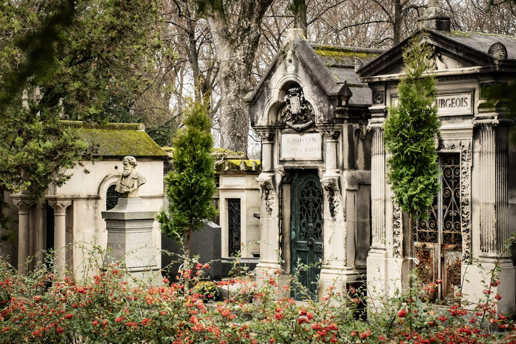
Stone Texts: Typography and Aging at Père Lachaise
A close look at funerary lettering: serif choices, carving depth, and how weathering affects legibility.
11/3/2025
17 min read

Inscriptions speak through form. Serif choices, carving depth, and weathering shape legibility and tone.
Typographic Notes
- Serifs: Classical gravity.
- Sans: Modern clarity.
- Depth: Shadow and readability.
| Choice | Tone |
|---|---|
| Serif | Tradition |
| Sans | Modern |
📸 Gallery
Typography frames memory — letters as voices.
저자 소개

Epigraphy Enthusiast
오래도록 파리를 걸어온 이야기꾼으로서, 전설과 사랑 이야기, 조용한 추모, 그리고 ‘기억을 실천하는 다정함’을 따라 페르 라쉐즈에서 길을 찾도록 돕고자 이 안내서를 만들었습니다.
Tags
Père Lachaise
Typography
Inscriptions
Carving
Weathering
Comments (0)
Leave a Comment
Loading comments...