Horário de visitaFechado
|Domingo, Julho 12, 202616 Rue du Repos, 75020 Paris, França
Voltar para art
inscriptions
Stone Texts: Typography and Aging at Père Lachaise
A close look at funerary lettering: serif choices, carving depth, and how weathering affects legibility.
11/3/2025
17 min read

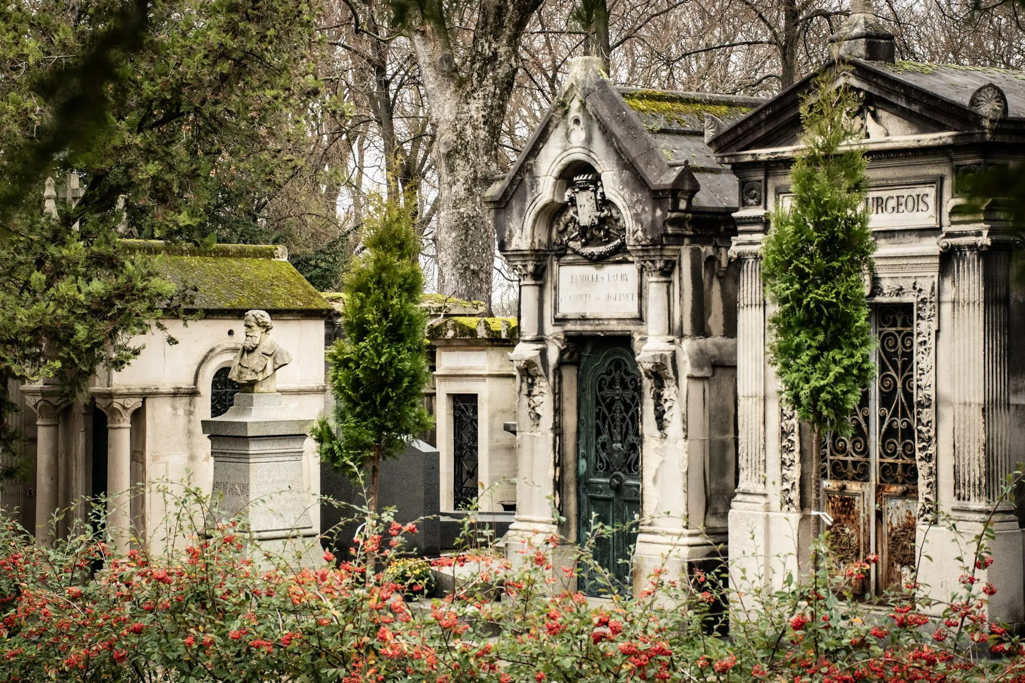
Inscriptions speak through form. Serif choices, carving depth, and weathering shape legibility and tone.
Typographic Notes
- Serifs: Classical gravity.
- Sans: Modern clarity.
- Depth: Shadow and readability.
| Choice | Tone |
|---|---|
| Serif | Tradition |
| Sans | Modern |
📸 Gallery
Typography frames memory — letters as voices.
Sobre o autor

Epigraphy Enthusiast
Caminhante e narrador de Paris há muitos anos, criei este guia para ajudar visitantes a orientarem-se no Père Lachaise — de lendas e histórias de amor a memoriais discretos e à ternura quotidiana da lembrança.
Tags
Père Lachaise
Typography
Inscriptions
Carving
Weathering
Comments (0)
Leave a Comment
Loading comments...