开放时间闭馆
|星期日, 七月 12, 202616 Rue du Repos, 75020 Paris, France
返回 art
inscriptions
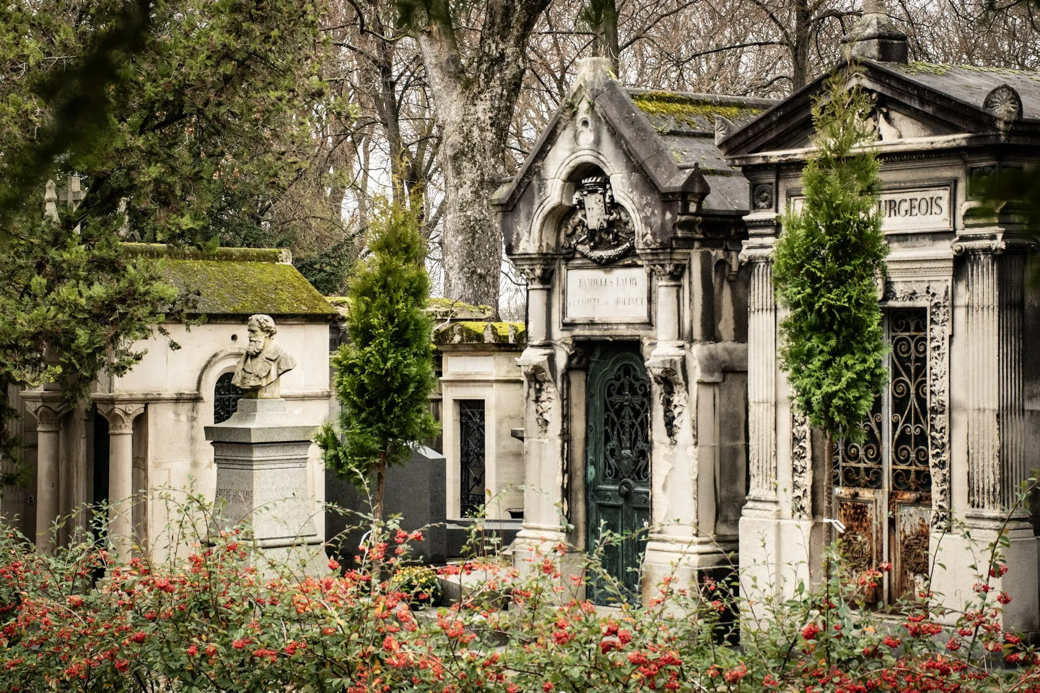
Stone Texts: Typography and Aging at Père Lachaise
A close look at funerary lettering: serif choices, carving depth, and how weathering affects legibility.
11/3/2025
17 min read

Inscriptions speak through form. Serif choices, carving depth, and weathering shape legibility and tone.
Typographic Notes
- Serifs: Classical gravity.
- Sans: Modern clarity.
- Depth: Shadow and readability.
| Choice | Tone |
|---|---|
| Serif | Tradition |
| Sans | Modern |
📸 Gallery
Typography frames memory — letters as voices.
关于作者

Epigraphy Enthusiast
我是一名长期在巴黎行走与叙述的人,写下这份指南是为了帮助来访者在拉雪兹神父公墓中找到方向——既走近传奇与爱情故事,也走近静默纪念与日常的温柔记忆实践。
Tags
Père Lachaise
Typography
Inscriptions
Carving
Weathering
Comments (0)
Leave a Comment
Loading comments...